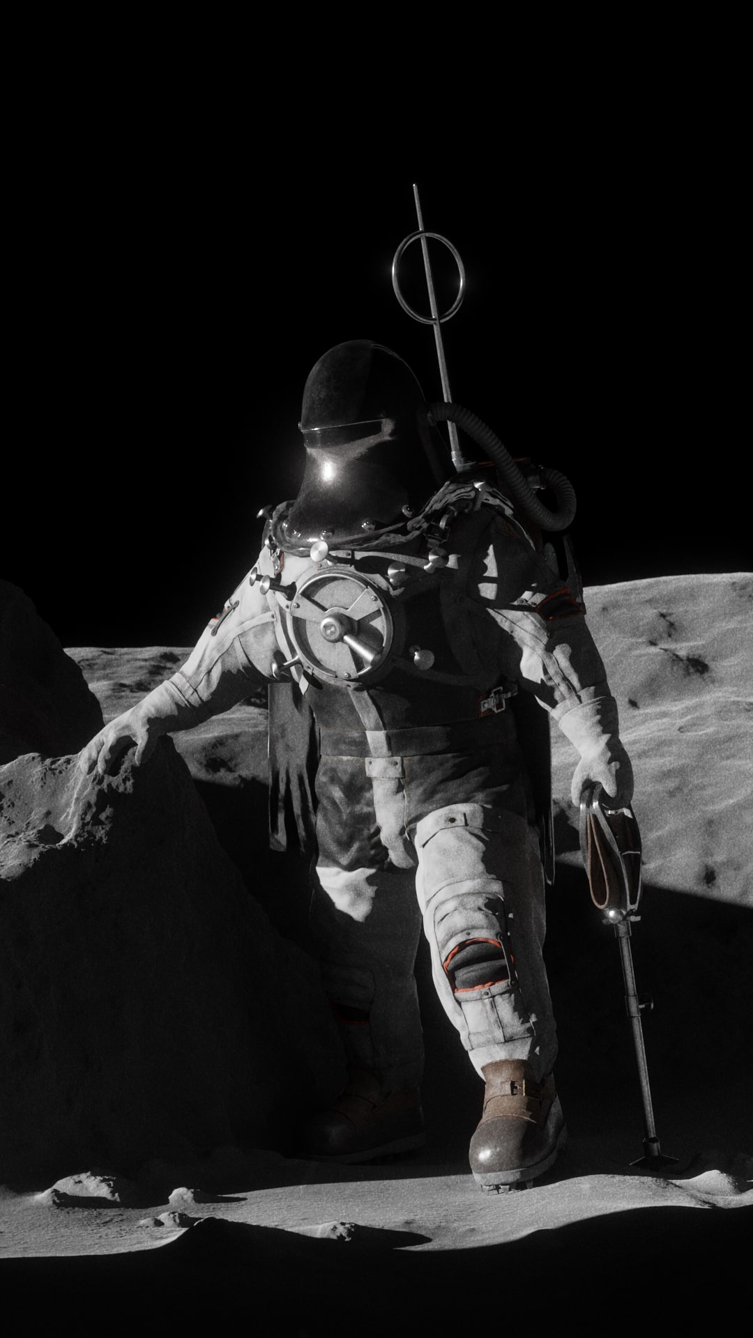
Tom Scott did a great video featuring work from the 'British Interplanetary Society'.
I was amazed to see designs and plans for a moon mission drawn up in the 1940s!
A modern model, based on designs for a lunar spacesuit, is on display at the National Space Centre.
There’s a sketch of an astronaut wearing the spacesuit, hiking out of a crater.
I thought it would be cool to see a realistic rendering of the image - perhaps like a film photo from an alternate history…
Sadly I couldn’t visit the model, but various photos online allowed me to benefit from its creators’ excellent work.
I have deviated where form and material were ambiguous to me, but hopefully this is close enough!


Everything was created in Blender + Krita in roughly 3-4 weeks.
It’s funny how much I had to dilute the sketch’s dramatic pose and landscape.
Thankfully, the awkward hopping and smooth hillscapes of the Apollo photos carry their own romance.
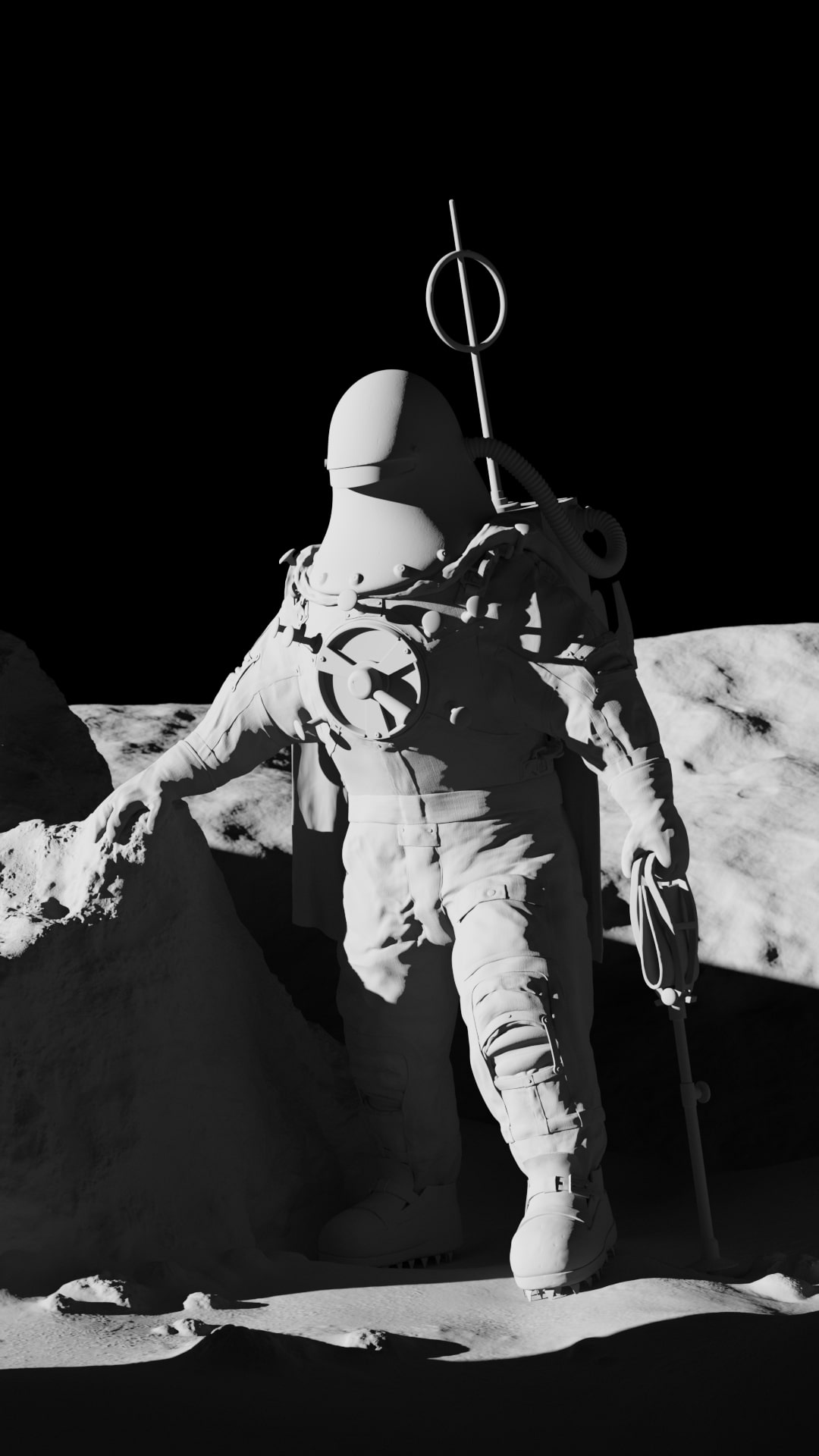
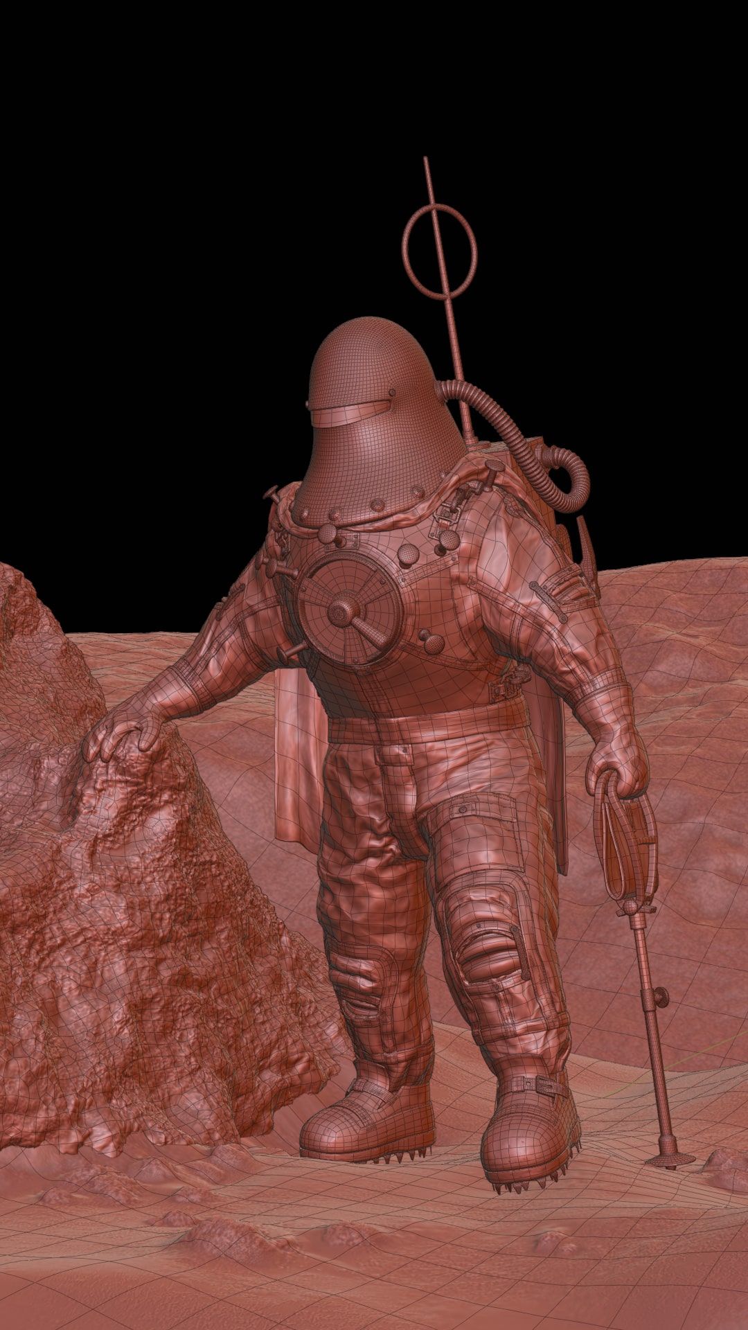
I first sub-D modelled the helmet, airlock, and other hard-surfaces over an A-posed figure.
I then box-modelled the fabric and straps. I probably should have sculpted the straps,
but I lacked experience and wanted to ensure a realistic gap where the fabric material is sealed together.
Once modelled, I began applying Multi-resolution modifiers and sculpting progressively finer levels of detail.
I should have been more careful to ensure that parallel rings of edge-loops formed square grid topology.
Long, thin polygons drove up subdivision levels unnecessarily.
Blender’s cloth brushes really helped ease me into sculpting believably folded cloth.
The ‘expand’ and ‘inflate’ modes are great for turning hand-sculpted forms into space-suit outer skins!
Once sculpting was finished I UV-unwrapped everything into multiple UV spaces (UDIMs were too new and scary),
then set about painting grey-scale maps for dust, wear e.t.c.
Combining hand-painted masks with nodes and small tiling textures is a really fun way to build tweak-able materials.
The helmet’s material was tricky as the appearance of chrome-like metals are very much defined by their surroundings.
On the moon, facing upwards, exposed for the brightness of sunlit regolith, the surroundings are: black.
Although I started out with a symmetrical model and (basic) rig,
the mess of interpenetrating seams forced me to hand-edit a lot of stuff, committing me to the chosen pose.
It’s definitely not a neat, reusable asset, but that’s okay :)
I’d love to see how productions like ‘For All Mankind’ or ‘Gravity’ manage their CG spacesuits!
This project was fun, but I think I'm going to focus more on traditional media to improve my art.
Being more confident in composition, and able to manually sculpt the cloth, would have been handy.
Maybe people will go back to the Moon soon...
Hopefully it'd be a truly international effort, and scientifically justifiable in comparison to robotic exploration.
I ended up diving in to traditional media, and it's been great!
Everything I make has benefited, and I'm interested to see how my future CG projects are informed by it.
That said, I've also enjoyed being outside of the CG world for a bit. In my opinion, the community still has a lot of growing up to do! Portfolio sites are still full of art that perpetuates horrible ideas about women and girls - especially east asian women.
Pieces are often celebrated for technical merit, with any broader argument dismissed, even by ostensibly feminist and anti-racist contributors.